Inbox components structure
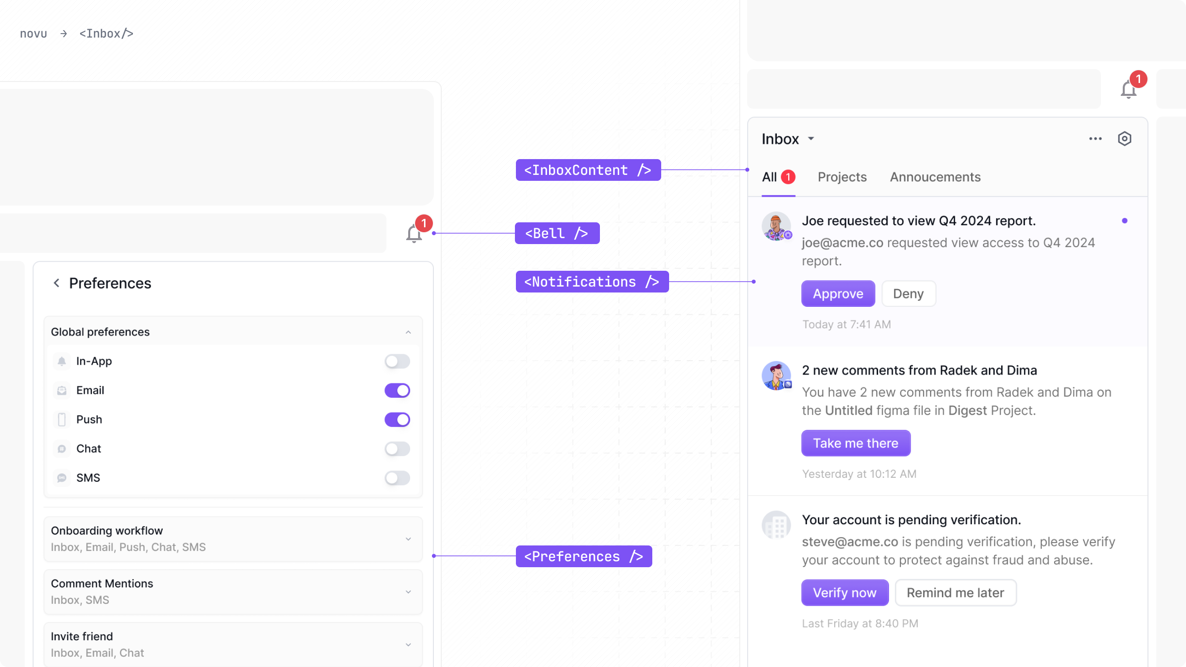
Composition
The Inbox is composed of the following sub-components that you can use to build your Inbox structure and layout:
Inbox
The Inbox wrapper, which is used to wrap the entire inbox UI and establish the session
Bell
Used to display the bell icon and trigger the popover component when clicked
Notifications
Displays the notifications list
Preferences
Used to display the preferences modal
InboxContent
Usage with a custom popover
The internal UI and styles for those components can be modified using the appearance prop.
Layouts
The composition of the indivudal components can generate multiple different popular inbox layouts.
Inbox with Bell (Default)
A trigger button usually located at the top right corner of the screen, which triggers the popover component when clicked.
Side menu Inbox
To render a side menu inbox, use the <Notifications /> component as a direct child of the <Inbox /> component, you can hide or show it based on any custom logic.
Full page Inbox
Similiary to the side menu inbox, you can use the <Notifications /> component as a direct child of the <Inbox /> component, you can hide or show it based on any custom logic.