Display the standalone notification feed
You can render the notification feed directly into any part of your application, such as a dashboard panel or a dedicated notifications page. This is useful for situations where you don’t need a popover trigger at all. Novu provides two components for this. Both components support the same customization props as the Inbox component, except for configuration options (likeapplicationIdentifier, subscriber, and renderBell).
Notifications component
The Notifications component renders the core notification experience, which includes the Inbox header (with title and dropdown), the scrollable list of notifications, and the footer.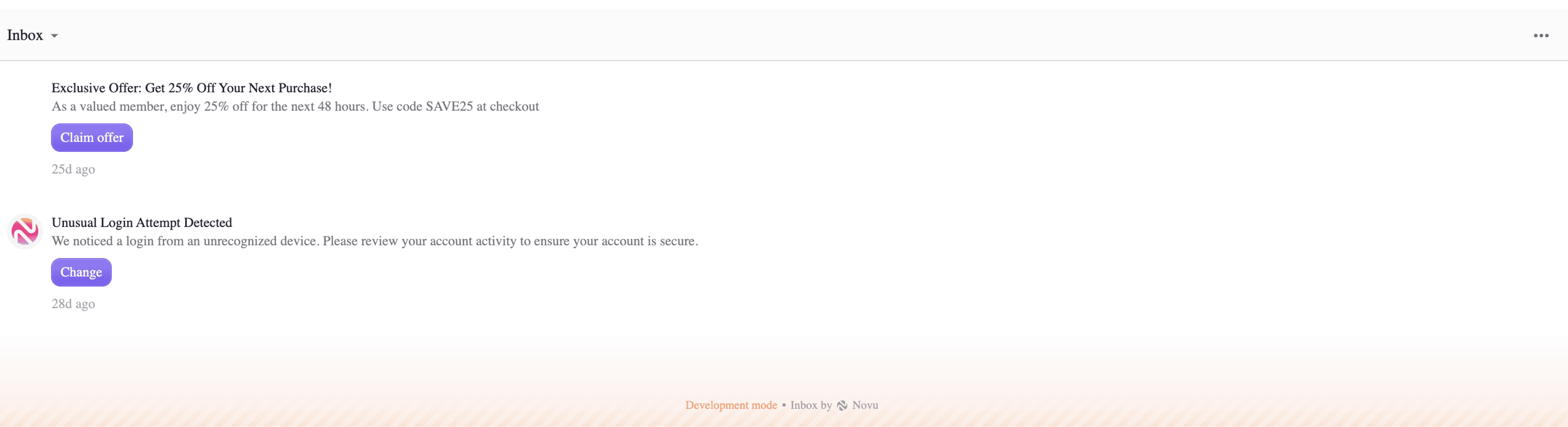
InboxContent component
The InboxContent component renders everything the Notifications component does, but with one key addition: the Preferences page. This allows users to manage their notification settings directly from the component.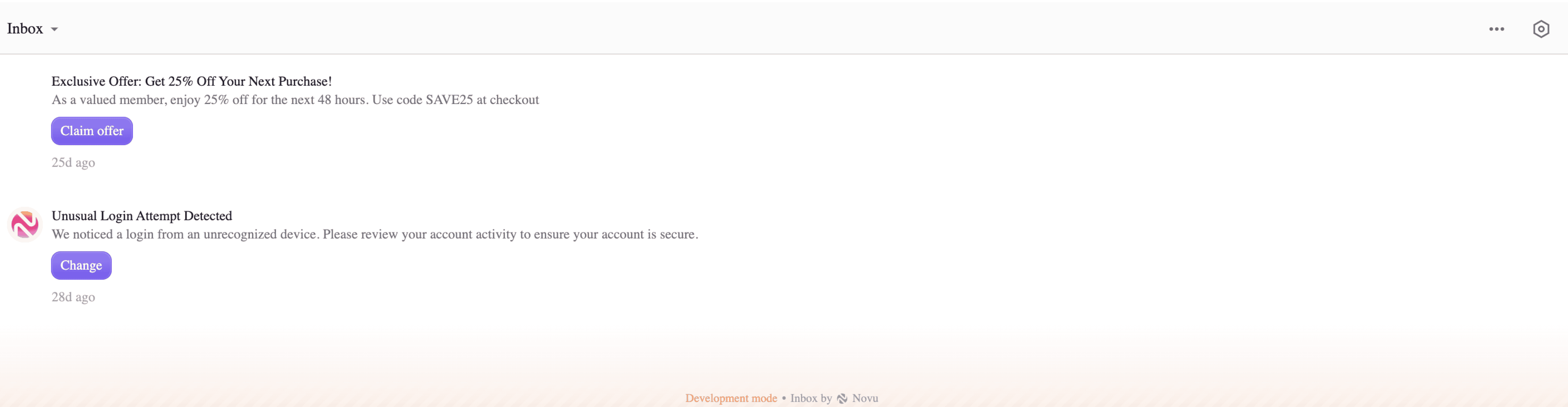
Building a custom popover
Use the Notifications or InboxContent components inside your own popover to keep all of Novu’s notification functionality while integrating with any external UI library. Trigger the popover with the Bell component or your own custom trigger.- Using Notifications
- Using InboxContent
- With shadcn/ui Drawer