The Novu Inbox component is designed to be fully themeable and adaptable to your application’s visual language. All theming options are exposed through the appearance prop, which allows you to apply custom styles at different levels of control from predefined themes to component-level overrides. The appearance prop supports the following keys:
  • baseTheme: Apply a predefined theme (for example, light or dark).
  • variables: Define global styling properties (for example, colors, fonts).
  • elements: Style individual UI components.
  • icons: Replace default icons with custom ones.
  • animations: Enable or disable UI animations.
Check out the Inbox Playground to see how the Inbox looks with common design presets. It showcases pre-styled variants like Notion and Reddit, which is helpful for seeing what’s possible before you start customizing.

Understand style injection

When rendered, the Inbox component automatically injects its styles into the <head> of the HTML document. If the component is rendered inside a shadow DOM, styles are scoped and injected into the shadow root instead. This ensures that:
  • Styles remain encapsulated and do not leak into global stylesheets
  • No additional setup is required to manage scoped styling

Apply base theme

You can apply a predefined visual style to the entire Inbox UI by passing the baseTheme object inside the appearance prop. This is a quick way to implement a dark mode or any base look and feel without redefining every variable.

Dark mode

Novu currently provides a built-in dark theme, which you can import from @novu/react/themes.
import { Inbox } from '@novu/react';
import { dark } from '@novu/react/themes';

function Novu() {
  return (
    <Inbox
      applicationIdentifier="YOUR_APPLICATION_IDENTIFIER"
      subscriber="YOUR_SUBSCRIBER_ID"
      appearance={{ baseTheme: dark }}
    />
  );
}

export default Novu;

Define global variables

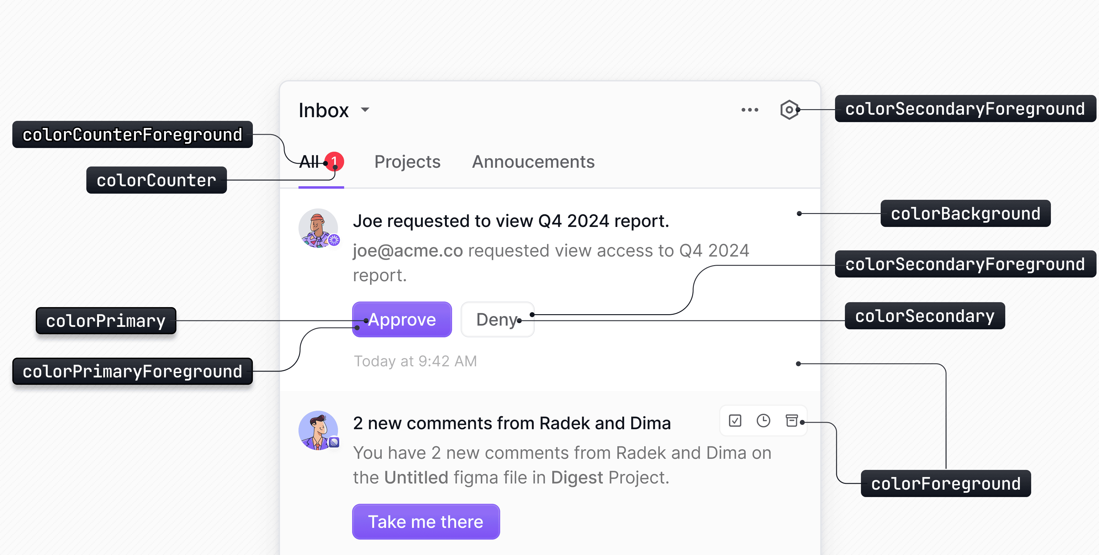
You can override the default styles in the Inbox component by passing a variables object inside the appearance prop. This is an efficient way to apply broad visual changes with minimal configuration. Define global variables
import { Inbox } from '@novu/react';

const appearance = {
  variables: {
    colorBackground: '#f0f0f0',
    borderRadius: '8px',
  },
};

function Novu() {
  return (
    <Inbox
      applicationIdentifier="YOUR_APPLICATION_IDENTIFIER"
      subscriber="YOUR_SUBSCRIBER_ID"
      appearance={appearance}
    />
  );
}

export default Novu;
When both baseTheme and variables are provided, variables always take precedence over the base theme.

List of available variables

PropertyTypeDescription
colorBackgroundstringThe background color of the inbox component.
colorForegroundstringThe primary text color used in the inbox.
colorPrimarystringThe main accent color for interactive elements.
colorPrimaryForegroundstringThe text color used on primary-colored elements.
colorSecondarystringA secondary color for less prominent elements.
colorSecondaryForegroundstringThe text color used on secondary-colored elements.
colorCounterstringThe background color of notification counters.
colorCounterForegroundstringThe text color used in notification counters.
colorNeutralstringA neutral color used for borders or backgrounds.
colorShadowstringThe color of shadows applied to elements.
colorRingstringThe color used for focus rings on interactive elements.
fontSizestringThe base font size for text in the inbox.
borderRadiusstringThe border radius applied to various elements.
colorStripesstringThe accent color used for striped loading indicators.

Style the Inbox UI elements

You can define styles for individual UI components within the Inbox UI by passing the elements object inside the appearance prop. Each key corresponds to a specific component, and the value can be either a style object or a set of CSS classes. Finding element selectors Here’s a list of some available elements that can be styled using the elements object in your appearance configuration:
ElementKey in appearance.elements
Primary action buttonnotificationPrimaryAction__button
Secondary action buttonnotificationSecondaryAction__button
Notification containernotification
Subject textnotificationSubject
Body textnotificationBody
Notification icon/imagenotificationImage
Preferences buttonpreferences__button
Date displaynotificationDate
Archive buttonnotificationArchive__button
Snooze buttonnotificationSnooze__button
Unread/read indicator buttonnotificationUnread__button
Notification list containernotificationList
Schedule containerscheduleContainer
Schedule headerscheduleHeader
Schedule bodyscheduleBody
Schedule tablescheduleTable
Day schedule copy titledayScheduleCopyTitle
Day schedule copy menudayScheduleCopy__dropdownContent
Time select drop-down listtimeSelect__dropdownTrigger
Time select listtimeSelect__dropdownContent
Inbox popover contentinbox__popoverContent
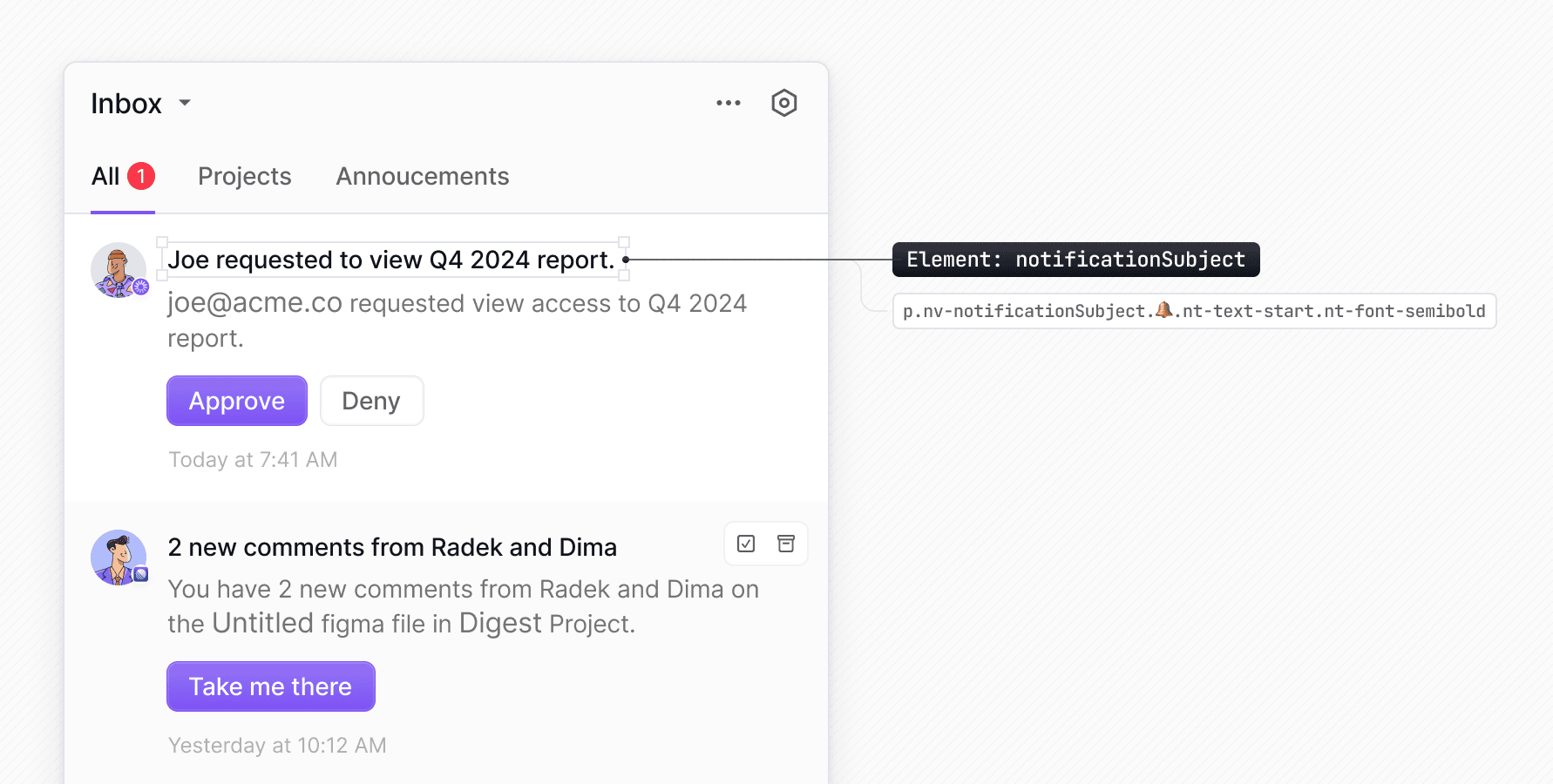
How to find other elements?Any selector that appears before the 🔔 emoji in the Devtools can be targeted via the elements property in the appearance prop (stripping the nv- prefix). You can also use TypeScript autocomplete to find the available elements. For the complete list of Inbox element keys, see the React SDK appearance reference.
You can pass inline styles to individual elements using the elements object in the appearance prop. Each element accepts a style object.
import { Inbox } from '@novu/react';

const appearance = {
  elements: {
    notificationSubject: {
      color: '#ff0000',
    },
  },
};

function Novu() {
  return (
    <Inbox
      applicationIdentifier="YOUR_APPLICATION_IDENTIFIER"
      subscriber="YOUR_SUBSCRIBER_ID"
      appearance={appearance}
    />
  );
}

export default Novu;

Apply styles dynamically using contextual callbacks

You can customize specific parts of the Inbox UI by providing callback functions for certain keys. This function receives contextual information such as unread counts, notification data, or preference details and lets you apply styles dynamically based on runtime values from your application.
KeyContext signature
Bell
bellDot(context: { unreadCount: { total: number; severity: Record<string, number> } }) => string
bellIcon(context: { unreadCount: { total: number; severity: Record<string, number> } }) => string
bellContainer(context: { unreadCount: { total: number; severity: Record<string, number> } }) => string
severityHigh__bellContainer(context: { unreadCount: { total: number; severity: Record<string, number> } }) => string
severityMedium__bellContainer(context: { unreadCount: { total: number; severity: Record<string, number> } }) => string
severityLow__bellContainer(context: { unreadCount: { total: number; severity: Record<string, number> } }) => string
bellSeverityGlow(context: { unreadCount: { total: number; severity: Record<string, number> } }) => string
severityGlowHigh__bellSeverityGlow(context: { unreadCount: { total: number; severity: Record<string, number> } }) => string
severityGlowMedium__bellSeverityGlow(context: { unreadCount: { total: number; severity: Record<string, number> } }) => string
severityGlowLow__bellSeverityGlow(context: { unreadCount: { total: number; severity: Record<string, number> } }) => string
Preferences list (shared)
preferencesContainer(context: { preferences?: Preference[]; groups: Array<{ name: string; preferences: Preference[] }> }) => string
Preference
workflowContainer(context: { preference: Preference }) => string
workflowLabelContainer(context: { preference: Preference }) => string
workflowLabelHeader(context: { preference: Preference }) => string
workflowLabelHeaderContainer(context: { preference: Preference }) => string
workflowLabelIcon(context: { preference: Preference }) => string
workflowLabel(context: { preference: Preference }) => string
workflowArrow__icon(context: { preference: Preference }) => string
workflowContainerRight__icon(context: { preference: Preference }) => string
Channel
channelsContainer(context: { preference: Preference }) => string
channelName(context: { preference: Preference }) => string
Channel Row (shared)
channelContainer(context: { preference?: Preference; preferenceGroup?: { name: string; preferences: Preference[] } }) => string
channelLabelContainer(context: { preference?: Preference; preferenceGroup?: { name: string; preferences: Preference[] } }) => string
channelIconContainer(context: { preference?: Preference; preferenceGroup?: { name: string; preferences: Preference[] } }) => string
channelLabel(context: { preference?: Preference; preferenceGroup?: { name: string; preferences: Preference[] } }) => string
channelSwitchContainer(context: { preference?: Preference; preferenceGroup?: { name: string; preferences: Preference[] } }) => string
channel__icon(context: { preference?: Preference; preferenceGroup?: { name: string; preferences: Preference[] } }) => string
Preferences Group
preferencesGroupContainer(context: { preferenceGroup: { name: string; preferences: Preference[] } }) => string
preferencesGroupHeader(context: { preferenceGroup: { name: string; preferences: Preference[] } }) => string
preferencesGroupLabelContainer(context: { preferenceGroup: { name: string; preferences: Preference[] } }) => string
preferencesGroupLabelIcon(context: { preferenceGroup: { name: string; preferences: Preference[] } }) => string
preferencesGroupLabel(context: { preferenceGroup: { name: string; preferences: Preference[] } }) => string
preferencesGroupActionsContainer(context: { preferenceGroup: { name: string; preferences: Preference[] } }) => string
preferencesGroupActionsContainerRight__icon(context: { preferenceGroup: { name: string; preferences: Preference[] } }) => string
preferencesGroupBody(context: { preferenceGroup: { name: string; preferences: Preference[] } }) => string
preferencesGroupChannels(context: { preferenceGroup: { name: string; preferences: Preference[] } }) => string
preferencesGroupInfo(context: { preferenceGroup: { name: string; preferences: Preference[] } }) => string
preferencesGroupInfoIcon(context: { preferenceGroup: { name: string; preferences: Preference[] } }) => string
preferencesGroupWorkflows(context: { preferenceGroup: { name: string; preferences: Preference[] } }) => string
Notification list
notificationList(context: { notifications: Notification[] }) => string
notificationListContainer(context: { notifications: Notification[] }) => string
Notification
notification(context: { notification: Notification }) => string
severityHigh__notification(context: { notification: Notification }) => string
severityMedium__notification(context: { notification: Notification }) => string
severityLow__notification(context: { notification: Notification }) => string
notificationBar(context: { notification: Notification }) => string
severityHigh__notificationBar(context: { notification: Notification }) => string
severityMedium__notificationBar(context: { notification: Notification }) => string
severityLow__notificationBar(context: { notification: Notification }) => string
notificationImageLoadingFallback(context: { notification: Notification }) => string
notificationImage(context: { notification: Notification }) => string
notificationContent(context: { notification: Notification }) => string
notificationTextContainer(context: { notification: Notification }) => string
notificationSubject(context: { notification: Notification }) => string
notificationBody(context: { notification: Notification }) => string
notificationDefaultActions(context: { notification: Notification }) => string
notificationCustomActions(context: { notification: Notification }) => string
notificationPrimaryAction__button(context: { notification: Notification }) => string
notificationSecondaryAction__button(context: { notification: Notification }) => string
notificationDate(context: { notification: Notification }) => string
notificationDeliveredAt__badge(context: { notification: Notification }) => string
notificationDeliveredAt__icon(context: { notification: Notification }) => string
notificationSnoozedUntil__icon(context: { notification: Notification }) => string
notificationDot(context: { notification: Notification }) => string
Schedule
scheduleContainer(context: { schedule?: Schedule }) => string
scheduleHeader(context: { schedule?: Schedule }) => string
scheduleLabelContainer(context: { schedule?: Schedule }) => string
scheduleLabelScheduleIcon(context: { schedule?: Schedule }) => string
scheduleLabelInfoIcon(context: { schedule?: Schedule }) => string
scheduleLabel(context: { schedule?: Schedule }) => string
scheduleActionsContainer(context: { schedule?: Schedule }) => string
scheduleActionsContainerRight(context: { schedule?: Schedule }) => string
scheduleBody(context: { schedule?: Schedule }) => string
scheduleDescription(context: { schedule?: Schedule }) => string
scheduleTable(context: { schedule?: Schedule }) => string
scheduleTableHeader(context: { schedule?: Schedule }) => string
scheduleHeaderColumn(context: { schedule?: Schedule }) => string
scheduleTableBody(context: { schedule?: Schedule }) => string
scheduleBodyRow(context: { schedule?: Schedule }) => string
scheduleBodyColumn(context: { schedule?: Schedule }) => string
scheduleInfoContainer(context: { schedule?: Schedule }) => string
scheduleInfoIcon(context: { schedule?: Schedule }) => string
scheduleInfo(context: { schedule?: Schedule }) => string
Day Schedule Copy
dayScheduleCopyTitle(context: { schedule?: Schedule }) => string
dayScheduleCopyIcon(context: { schedule?: Schedule }) => string
dayScheduleCopySelectAll(context: { schedule?: Schedule }) => string
dayScheduleCopyDay(context: { schedule?: Schedule }) => string
dayScheduleCopyFooterContainer(context: { schedule?: Schedule }) => string
Here are some examples:

Style the bell icon based on unread count

You can change the bell icon color gradient based on the total number of unread notifications. The callback receives an unreadCount object, which is then used in the conditional logic.
import { Inbox } from '@novu/react';

export default function Novu() {

  const appearance = {
    elements: {
      bellIcon: ({ unreadCount }) => {
        if (unreadCount.total > 1) {
          return '[--bell-gradient-start:var(--color-red-500)] [--bell-gradient-end:var(--color-red-500)]';
        }
        return unreadCount.total > 10
          ? '[--bell-gradient-start:var(--color-yellow-500)] [--bell-gradient-end:var(--color-yellow-500)]'
          : '[--bell-gradient-start:var(--color-gray-500)] [--bell-gradient-end:var(--color-gray-500)]';
      },
    },
  };

  return (
  <Inbox
    applicationIdentifier="YOUR_APPLICATION_IDENTIFIER"
    subscriber="YOUR_SUBSCRIBER_ID"
    appearance={appearance}
  />
);
}

Style notifications based on payload data

You can style individual notifications based on custom data in their payload. In the example below, the notification’s background color is changed if a specific field (foo) exists in the notification’s data object.
import { Inbox } from '@novu/react';

export default function Novu() {

    const appearance = {
    elements: {
      notification: ({ notification }) => {
        if (notification.data?.foo) {
          return 'bg-green-200';
        }

        return '';
      },
    },
  };

  return (
  <Inbox
    applicationIdentifier="YOUR_APPLICATION_IDENTIFIER"
    subscriber="YOUR_SUBSCRIBER_ID"
    appearance={appearance}
  />
);
}

Style notifications by severity

Notification severity comes with default visual styles, but you can fully customize how notifications look for each severity level using the appearance prop. Notification severity in the inbox
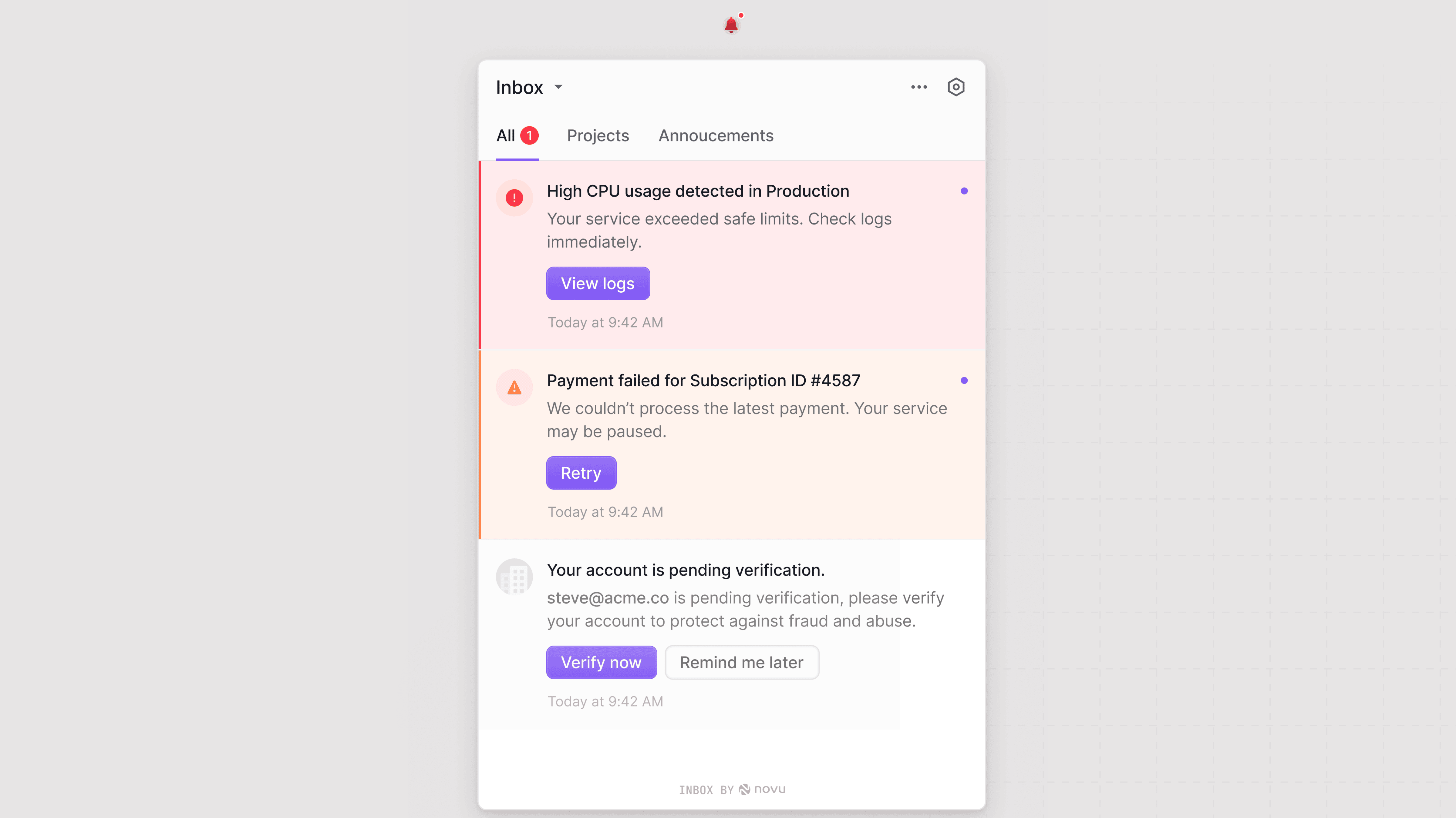
By default, the bell icon takes the color of the highest severity unread notification.
Each severity level exposes selectors you can target through the variables and elements objects to apply custom styling.

Customizing severity colors

You can override the default severity colors by setting new CSS custom properties in the appearance.variables object. Updating these variables automatically changes both the notification color and the bell icon color.
PropDescription
colorSeverityHighColor for high severity
colorSeverityMediumColor for medium severity
colorSeverityLowColor for low severity
const appearance = {
  variables: {
    colorSeverityHigh: 'green',
    colorSeverityMedium: 'blue',
    colorSeverityLow: 'yellow',
  }
};

Customizing severity elements

You can apply specific styles to individual components using keys in the appearance.elements object. This lets you target components conditionally based on their severity state.
const appearance = {
  elements: {
    severityHigh__notificationBar: {
      backgroundColor: 'red',
    },
  },
};
This table lists severity element keys:
Elements keyDescription
severityHigh__bellContainerStyles the bell container for high severity
severityMedium__bellContainerStyles the bell container for medium severity
severityLow__bellContainerStyles the bell container for low severity
bellSeverityGlowBase style for the severity glow around the bell
severityGlowHigh__bellSeverityGlowGlow style for high severity
severityGlowMedium__bellSeverityGlowGlow style for medium severity
severityGlowLow__bellSeverityGlowGlow style for low severity
severityHigh__notificationStyles individual high severity notifications
severityMedium__notificationStyles individual medium severity notifications
severityLow__notificationStyles individual low severity notifications
notificationBarBase style for the vertical notification bar on the left of a notification
severityHigh__notificationBarStyles the notification bar for high severity
severityMedium__notificationBarStyles the notification bar for medium severity
severityLow__notificationBarStyles the notification bar for low severity

Responsive Inbox using CSS media queries

On mobile and smaller devices, use the inbox__popoverContent element and apply a custom CSS class to it. Specify CSS media queries on this class and add the class in a global CSS file so that it takes effect. In the example below, media queries are applied to the novu-inbox-popover-content class in a global CSS file.
ResponsiveInbox.tsx
import { Inbox } from '@novu/react';

const ResponsiveInbox = () => {
  return (
    <Inbox
      applicationIdentifier="YOUR_APPLICATION_IDENTIFIER"
      subscriber="YOUR_SUBSCRIBER_ID"
      appearance={{
        elements: {
          inbox__popoverContent: "novu-inbox-popover-content",
        },
      }}
    />
  );
};

export default ResponsiveInbox;
global.css
.novu-inbox-popover-content {
  max-width: 500px;
}

@media (max-width: 768px) {
  .novu-inbox-popover-content {
    max-width: 350px;
  }
}

@media (max-width: 480px) {
  .novu-inbox-popover-content {
    max-width: 250px;
  }
}

@media (max-width: 320px) {
  .novu-inbox-popover-content {
    max-width: 200px;
  }
}